Reading a Distribution: Why the Middle Misleads
Every projection you have ever read was a summary. Behind the single number sits a whole range of outcomes with a shape, and that shape decides whether a line clears. Learn to ask for the shape and the average stops being the interesting part.
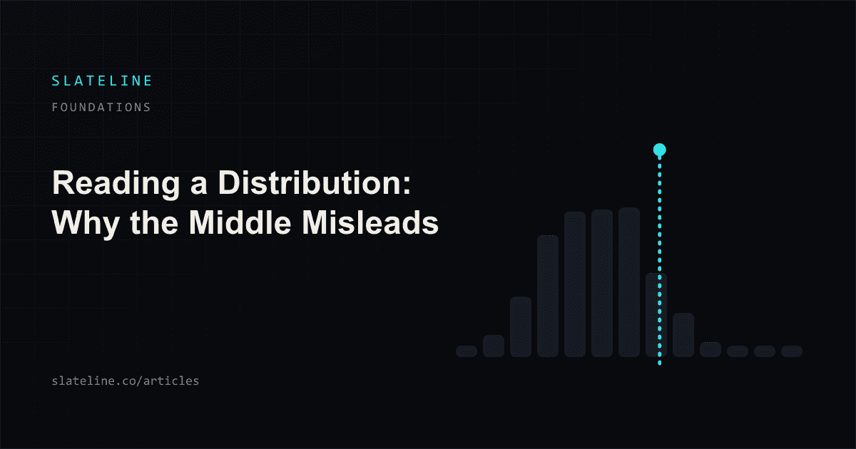
Ask someone what a model says about a player and you will get a single number back. Six point two strikeouts. Nineteen point four points. One point one total bases. The number sounds like the answer. It is closer to a headline: a summary written after the real work, chosen because a sentence cannot carry a shape.
The real work is the shape. A projection system does not compute an average and stop; it produces a full range of possible outcomes with different weights on each, and the average is one of several ways to compress that range down to something quotable. Compressing is lossy. Almost everything that decides whether a specific line clears lives in the part that got thrown away.
The number you were given is a summary of something bigger
Picture the underlying object rather than the headline. For a pitcher's strikeouts, the object is a set of weights: some chance of two, some chance of four, more chance of five or six, a thinning stretch out toward eleven and twelve. Simulation based systems produce this directly by playing the game out many times and counting how often each result occurred; other approaches assume a mathematical form and fit it. Either way the output is a distribution, and the point estimate is a reduction of it.
This is why two research processes can agree perfectly on the average and disagree completely on the offer. They are quoting the same summary of different shapes. If you never look past the summary, you cannot see the disagreement, and you will assume you and the platform are arguing about the same thing when you are not. The mechanics of how these ranges get built are covered in how projections are actually produced; this piece is about reading one once you have it.
What percentiles actually say
The most useful way to describe a shape in a few numbers is with percentiles. A percentile is a value with a share of the distribution below it. The 25th percentile, often written p25, is the value that a quarter of outcomes fall short of. The 75th is the value that three quarters fall short of. Together they mark the middle half of the outcomes: a quiet but honest statement of how much room the projection is leaving for reality.
- p25 is a soft floor, not a worst case. One outcome in four lands below it, and some of those land far below it.
- p75 is a soft ceiling with the same warning attached in the other direction.
- The distance between p25 and p75 is the width of the ordinary. A wide gap means the model expects a broad spread of normal nights.
- The tails beyond p5 and p95 carry small weights but large values, and on some stats they carry most of the interesting outcomes.
The mistake to avoid is reading p25 and p75 as bounds. They are not predictions of the worst and best cases; they are the boundary posts of the middle half. A quarter of the time the result will be lower than the floor you were shown, and that quarter is not a model failure. It is the model telling you in advance that this happens.
Median and mean, and why they separate
Two summaries compete for the word average. The median is the middle outcome: half of the simulated nights land below it, half above. The mean is the arithmetic average of every outcome, so an unusually large result pulls it upward in proportion to how large it was. On a symmetric shape these two land in the same place and nobody has to care. Most player prop distributions are not symmetric.
The reason is structural rather than statistical. Counting stats have a hard floor at zero and no matching ceiling. A receiver cannot record negative catches. A hitter cannot post negative total bases. But an unusual night can produce three home runs, or a fourteen strikeout start, or a hat trick, and the distance from the typical night up to that ceiling is far greater than the distance down to zero. The shape gets stretched to the right. That asymmetry has a name, skewness, and on low count stats it is the rule and not the exception.
So the mean sits above the median, sometimes by a lot. And here is the part that matters: the mean is inflated by outcomes that are rare. The rare big night is real, it belongs in the model, and it will genuinely occur sometimes. It just does not occur on most nights, which means an average built partly from it describes very few actual nights well.
Suppose a made up outfielder is simulated ten thousand times for total bases. Suppose the results come back roughly as follows: about 4,100 nights with zero bases, about 3,100 with one, about 1,500 with two, about 800 with three, and the remaining 500 spread from four up to a rare nine. The median of that set is one base, because the halfway point falls in the one base group. The mean works out near 1.25, because the handful of five and seven and nine base nights drag it up. Quote 1.25 as the projection and you have quoted a value the player never actually records, on any night, ever. He records zero, or one, or two. Every number here is invented to make the arithmetic visible.
None of this makes the mean wrong. It is the correct answer to a specific question, which is what you would collect on average across many repetitions. It is simply the wrong summary to reach for when the question is whether one night clears one threshold.
Why the gap matters most at 0.5 and 1.5
The lower the line, the more the shape decides everything and the less the average tells you. At a threshold of 0.5 the only question in the world is whether the player records zero. Nothing else is being asked. A player with a 1.25 mean built out of many zeros and a few enormous nights can be far less likely to record at least one than a steadier player with a lower mean who almost never blanks.
Read that again in terms of the offer. Two players, one with the higher average, and the player with the lower average is the better over at 0.5. That is not a paradox and it is not an edge case. It is the direct consequence of a right stretched shape being summarized by its mean, and it is the single most common way that average driven research picks the wrong side on low lines.
At 1.5 the same logic applies with an extra wrinkle: you now need two of something, which puts you into the part of the distribution where the concentration of outcomes falls off quickly. Small changes in shape move that probability more than small changes in the mean do. And on integer lines the question gets a third answer entirely, because the exact number is its own outcome with its own weight.
Identical averages, different answers
Set two players side by side with the same projected mean and let their shapes differ. One is steady: her results cluster tightly, she rarely posts nothing, she rarely explodes. The other is boom or bust: he blanks often and occasionally goes off. Their averages match. Their probability of clearing any specific line does not, and the direction of the difference flips depending on where the line sits.
Below the middle of the range, the steady player is the stronger over, because he clears modest thresholds routinely while the volatile player keeps posting zeros. Above the middle, it reverses: the volatile player is the stronger over, because reaching an aggressive number requires exactly the kind of night only he produces. Same mean, opposite conclusions, decided entirely by shape and by where the platform placed the threshold.
This is the practical reason a projection that reports only a point estimate is incomplete for prop research. It answers a question about the long run when you are being sold a question about one specific cut point. Translating a shape into a probability at a threshold is the whole job, and reading those probabilities honestly is the skill that sits on the other side of it.
Variance is information, not noise to be smoothed away
There is a habit, inherited from season long fantasy thinking, of treating spread as an annoyance. Averaging is comforting. It produces one clean number per player and lets you rank them. But in prop research the spread is not interference sitting on top of a signal; it is part of what you are estimating. A model that gets the middle right and the width wrong will be confidently wrong at every threshold away from the middle, which is where most of the interesting offers live.
Width comes from real sources and they are worth naming. Opportunity varies: playing time, batting order position, rotation, whether a match goes the distance. Conversion varies: shooting, contact quality, finishing. Game state varies: a blowout takes minutes away, a shootout adds them. When a model widens or narrows a distribution, it should be able to say which of those it is representing. A width that appears from nowhere as a tuning knob is a fitted parameter with a good disguise, and the same skepticism applies to thin markets where the sample is small and the width is largely guessed.
Ask for the shape, not the average
The practical change is small and it survives contact with any tool, including a spreadsheet. Before you form an opinion on an offer, ask four questions of whatever produced your estimate.
- What is the probability at this exact threshold, rather than the average? That is the number the offer is about.
- How wide is the middle of the range, and does that width match what you know about the player's opportunity?
- Is the shape stretched to one side, and if so, is the average sitting above the typical night?
- On an integer line, what happens if the result lands exactly on the number? That outcome has weight and it belongs in the accounting.
If the tool cannot answer the first question, it is not really a prop research tool; it is a projection list with props bolted on. If it cannot answer the second and third, treat its probabilities as rough. And if it answers all four but never publishes whether its bands hold up against results, treat the whole thing as a hypothesis rather than a measurement.
Once you start reading shapes, the board looks different. Averages stop being the interesting part of a projection and start being the packaging. Slateline's boards carry the probability at the posted line rather than only the point estimate, alongside the distribution behind it, on the signal board.
References
- Percentile (Wikipedia)
- Median (Wikipedia)
- Skewness (Wikipedia)
See the research in practice
Slateline grades every projection it publishes and shows its record in the open. Browse the Model Room to see hit rates, calibration, and methodology for every sport we cover.
Open the Model RoomKeep researching
How Player Prop Projections Work
Ask a projection what a player will do tonight and the honest answer is not a number. It is a shape: a range of outcomes with probabilities attached. This article walks through how that shape gets built, layer by layer, and why the shape matters more than the average sitting in the middle of it.
How to Read Probability in Player Prop Research
Two researchers can look at the same prop, run sound processes, and land on 54 percent and 57 percent. Neither is wrong yet. Learning to think in that language, small percentages, long runs, honest error bars, is the difference between research and a highlight reel with numbers on it.
A Player Prop Glossary: Precise Definitions for Research
Most arguments about player props are really arguments about vocabulary. One person says probability and means what a platform charges; another says it and means what a model estimated. This glossary defines each term narrowly and says what it does not mean.